
Instructional Design Spotlight:
Course Appearance
April 29, 2021
“You never get a second chance to make a first impression…” Instructional Design welcomes a user into a learning environment… For better or worse: the initial visual impact can invite users to begin learning or have them turn away disinterested or overwhelmed.
Learning Pool’s Instructional Design Team makes purposeful decisions about arranging courses in a way that maximizes the impact on learning. Direction, organization, iconography, images, colors, and consistency are the stepping stones that lead learners into a pleasant and rewarding learning experience.
In this blog, we spotlight some of the ways in which Learning Pool uses design to create impactful learning experiences and contrast them with common but less effective designs.
A long scroll of course sections using basic LMS activities is plain and uninspired.
Vertical OneTopic Course Format, on the other hand, immediately organizes the same topics into a single, manageable screen. Aesthetically appealing, theme-matching and relevant banner images create interest and motivate learners to dive into the topic. Introductory information, bold headers, and icons create a consistent look that gives learners direction for what to expect and what to complete.
A list of important course information stretched out in one tabbed section leaves the learner to scroll and search for sought out items.
In contrast, the Vertical OneTopic Course Format organizes vital course information within the “Welcome” section and “Resources” section, which anchors the learner right away. These resources are accessible throughout the course via Glossary activities and links with clear visual indicators. Restricted access is used to reveal sections one week at a time and the sections are ordered in reverse so that the current week is always at the top.
Not even a well-designed course format is appropriate for every use case.
We use Vertical OneTopic (left) and Grid Format (Right) when contextually appropriate.
Vertical OneTopic is a great course format but is not the best format for a set of daily sections in which users must carefully track and select the proper training day.
The Grid Course Format transforms the look of the course into a calendar-type view. Users can clearly see the training day number and day of the week to complete activities and assignments. Good instructional design creates a simple look, motivating users to get their tasks done each day.
Though individual courses/course categories can be leveraged for excellent organization and navigation; consider housing related materials in a single place for easy access.
The image on the right organizes the same content as the image on the left in a more visually appealing way.
Using a single course to arrange all related information is a valuable way to keep users engaged and exploring; information is readily accessible and easy to keep updated.
While the lesson module is a great way to organize related learning material, it can also risk growing out of hand when the content is in-depth.
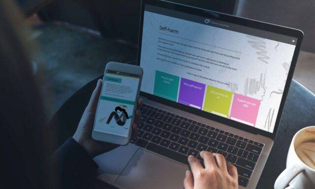
Deconstruct content into discrete, manageable pieces. Learners can get bogged down in the navigation of an overgrown lesson module and start to feel like they will never complete the required tasks. When the content is deconstructed into individual courses featuring intuitive sections, related images as visual confirmation of the topic, and manageable amounts of content, learners can work through the same amount of in-depth material (or even more!) with a sense of accomplishment and progress. Think about when to combine related material into a single space and when to break it apart into reasonable sections. While it is good to limit the information in view, the navigation of that information should also be considered. Highlighted sections can draw attention but also be a distraction to the continuous flow of a learner’s experience. The image on the right more logically sequences the flow of information than the image on the left.
OneTopic course format was set with a horizontal navigation path to share the continuous learning path with a simpler highlight on current information. The user experience carries from left to right across the top and then down into each section with vertical tabs to house additional learning behind engaging interactivity when ready. Clean, simple, organized focus keeps motivation moving in sync with the information flow. Consistent course format design can be repeated to help build expectation and confidence in a learner’s understanding of how to move through the content. Learning Pool’s Instructional Design Team has expertise and experience creating courses that welcome users to learn. Contact Learning Pool for more information about connecting with our team of designers to transform your courses for a greater impact on your learners.
Got a learning problem to solve?
Get in touch to discover how we can help